UI Frameworks Are a Second Language — Why I Chose Bootstrap 5 (and When I Wouldn’t)
10 Oct 2025TL;DR
UI frameworks are a second language. They come with vocabulary (classes), grammar (component APIs), and idioms (utility-first patterns). Learning Bootstrap 5 costs time and frustration, but the payoff is speed, accessibility, and a shared dialect that plain HTML/CSS rarely deliver on a deadline. Still, frameworks are not a hammer for every nail—here’s where they shine, where they get in the way, and what I learned while recreating a Starlink-style landing page.
Why not “just HTML and CSS”?
Because most real pages need more than boxes and colors. They need a responsive grid, a11y-respecting components, stateful interactions (collapse, dropdowns, modals), and a shared design vocabulary across a team. That’s what a framework sells: defaults that don’t embarrass you.
Could I hand-roll all of that? Yes. Would it be consistent across breakpoints, keyboard-friendly, and bug-free under time pressure? Unlikely.
My rule of thumb: if a page needs a nav, at least two sections, and interactive bits (menus, drawers, tabs), a framework usually pays for itself by lunch.
What Bootstrap 5 gave me in practice
1) A grid that behaves on the first try
row / col-lg-* plus spacing utilities (g-4, py-5, mt-5) got the hero + dual cards working across mobile and desktop in minutes, not hours.
2) Accessibility that starts at “OK”
navbar, dropdown, and collapse ship with focus management and ARIA. My job is to not break it, not to reinvent it.
3) A common dialect for teammates
“Make it btn btn-outline-light with rounded-pill” is faster than pasting CSS. Naming is a design system; Bootstrap provides a starter dictionary.
4) Utilities that nudge toward composition
Instead of a new CSS class per nuance, utilities like bg-opacity-75, shadow, rounded-4, position-absolute, top-0, and start-0 kept my CSS tiny and intent readable.
The sharp edges (because there are some)
- You fight the defaults eventually. Matching an existing brand often means overriding tokens, shadows, and radii, or unlearning component opinions.
- Class soup is real. Readable to practitioners, intimidating to newcomers.
- Weight & dependency. Shipping a whole framework for a minimal page is wasteful if you won’t use 90% of it.
- Leaky abstractions. When you want “LG and up still show a hamburger but also pin two links outside the collapse,” you’re negotiating with breakpoint rules.
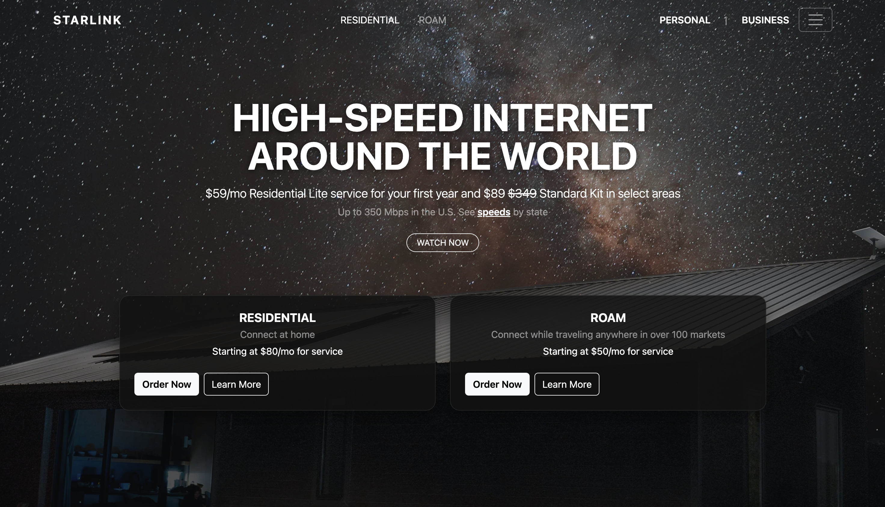
Case study: “Always-on hamburger” + “external links on desktop”
| My clone required a hamburger icon visible at all widths, while on LG and up two links (“Personal | Business”) live outside the collapsed menu. By default, navbar-expand-lg hides the toggler on large screens. I solved it by keeping Bootstrap’s collapse model and making a surgical override: |
Markup (excerpt)
<nav class="navbar navbar-expand-lg navbar-dark fixed-top bg-transparent py-3 js-nav">
  <div class="container">
    <a class="navbar-brand fw-bold letter-space-2 order-0" href="#">STARLINK</a>

    <!-- Collapsible content (available at all sizes) -->
    <div id="navMain" class="collapse navbar-collapse order-lg-1">
      <ul class="navbar-nav mx-lg-auto mb-2 mb-lg-0 gap-lg-3">
        <li class="nav-item"><a class="nav-link active" href="#hero">RESIDENTIAL</a></li>
        <li class="nav-item"><a class="nav-link" href="#hero">ROAM</a></li>
        <!-- Small screens also get these inside the collapse -->
        <li class="nav-item d-lg-none"><a class="nav-link" href="#business">PERSONAL</a></li>
        <li class="nav-item d-lg-none"><a class="nav-link" href="#business">BUSINESS</a></li>
      </ul>
    </div>

    <!-- Right rail (desktop-only externalized links) -->
    <div class="right-rail d-none d-lg-flex align-items-center order-lg-2 ms-auto">
      <a class="nav-link px-2" href="#business"><span class="fw-semibold text-uppercase">Personal</span></a>
      <span class="text-white-50 mx-1">|</span>
      <a class="nav-link px-2" href="#business"><span class="fw-semibold text-uppercase">Business</span></a>
    </div>

    <!-- Toggler: visible at ALL widths -->
    <button class="navbar-toggler always order-lg-3 ms-2" type="button"
            data-bs-toggle="collapse" data-bs-target="#navMain"
            aria-controls="navMain" aria-expanded="false" aria-label="Toggle navigation">
      <span class="navbar-toggler-icon"></span>
    </button>
  </div>
</nav>
CSS override (minimal)
/* Keep the hamburger visible even on lg+ */
.navbar .navbar-toggler.always {
  display: inline-block !important;
  border-color: rgba(255,255,255,.35);
}

/* Cosmetic helper for the desktop right rail */
.navbar .right-rail { gap: .75rem; }
This keeps the toggler always visible while duplicating critical links inside the collapse for small screens. It’s idiomatic Bootstrap with minimal custom CSS.
When I would not use a framework
- Ultra-light landing pages where every kilobyte matters and interactions are trivial.
- Highly bespoke brand systems where a design token pipeline (e.g., Style Dictionary + custom CSS) is a better fit.
- Learning exercises where the point is to practice raw layout, cascade, and modern CSS (grid, flex, container queries).
Bootstrap vs. Semantic UI (my quick take)
- API philosophy: Bootstrap blends components and utilities; Semantic UI’s class names read closer to English (“ui card”), which is friendly but can balloon HTML.
- Learning curve: Bootstrap wins on docs, examples, and ecosystem size (Stack Overflow answers abound).
- Themability: Both can be themed, but Bootstrap’s CSS variables (v5) make token-level tweaks cleaner in 2025.
- Team velocity: Bootstrap’s ubiquity means new teammates onboard fast, there’s a good chance they’ve used it.
Screenshots (evidence beats opinions)

What I’d do differently next time
- Extract a tiny token layer (colors, radii, shadows) up front to avoid ad-hoc overrides later.
- Use
containerqueries for a couple of content-driven tweaks that Bootstrap’s breakpoints don’t express. - Audit unused CSS/JS and consider a custom build if the page is small.
Conclusion
UI frameworks trade raw control for sane defaults and speed. If the task has moving parts (navigation, multiple sections, interactive bits) and a deadline, Bootstrap 5 is a pragmatic choice. As fidelity and brand demands rise, start reclaiming control: layer tokens, trim utilities, and keep only what pays rent.
That’s how I now see frameworks, not as training wheels, but as starter kits you responsibly outgrow in spots, not wholesale.
AI use disclosure
I used AI (ChatGPT) as a writing assistant to brainstorm structure, tighten phrasing, and sanity-check small code snippets. I did not have AI write the essay end-to-end; the narrative and claims reflect my experience and voice. All code here was reviewed and adapted by me for correctness and fit.