yamazemi.info — the site that got me into the seminar, and why I’m redesigning it
TL;DR
- yamazemi.info started as a simple, public home for the seminar’s info.
- It’s also my origin story: reading it convinced me to join the group.
- Today it’s a steady place for announcements, talk notes, and links.
- I’m rolling out a mobile-first redesign to make it easier to skim on phones.
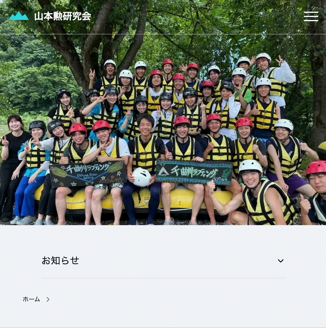
Why I made it
I first found the seminar through a plain, unassuming page—meeting times, recent talks, and a few write-ups. That page lowered the barrier to reach out. No mystery, no gatekeeping; just “here’s what we do.”
I built yamazemi.info to keep that feeling alive: a single, tidy place where a curious student can land, catch the vibe, and think, “I could be here.” That’s exactly what happened to me, and I want to keep that door open for the next person.
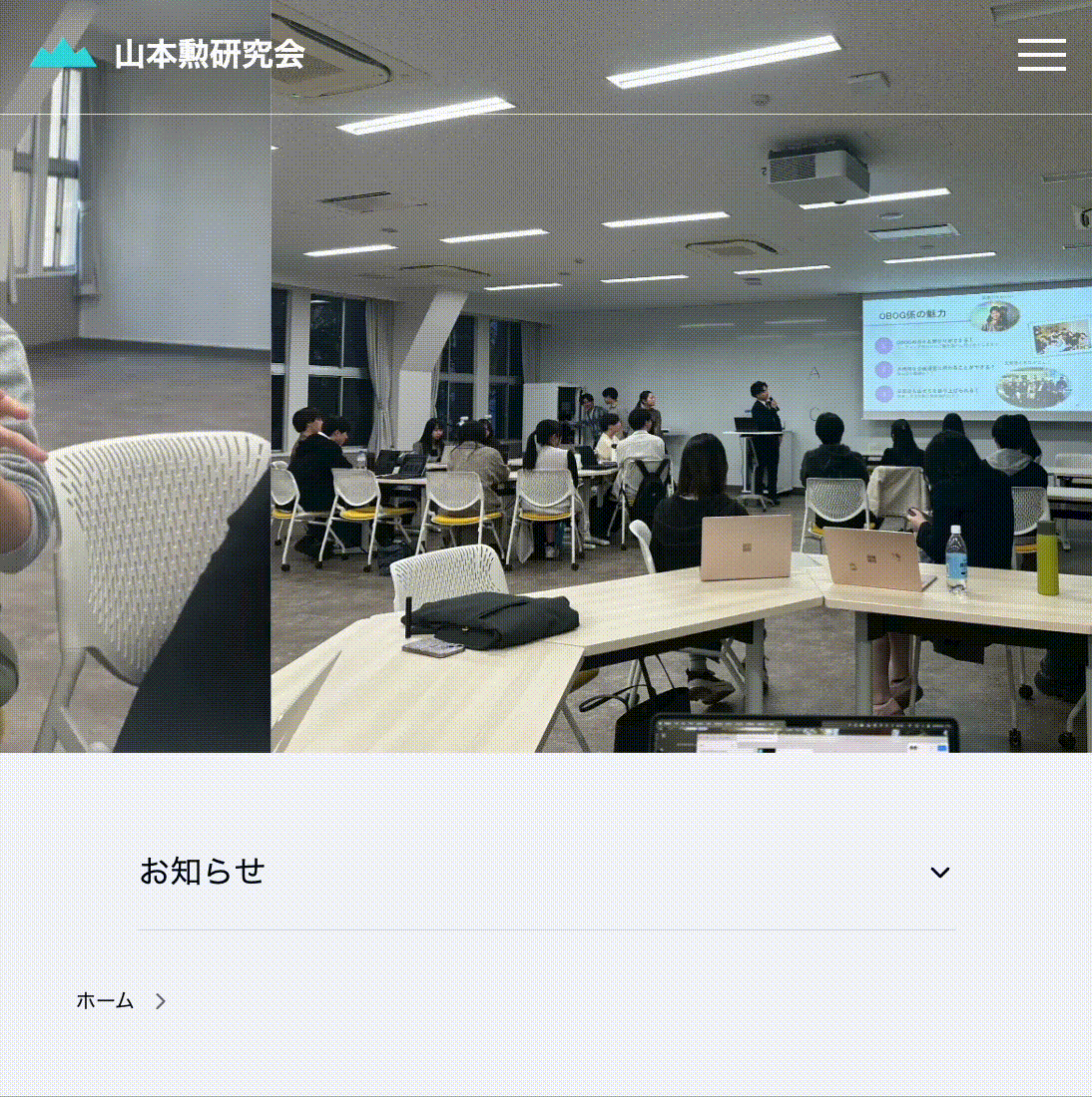
What lives on the site
- Upcoming sessions, quick summaries, and slides/links
- Recaps and reading lists from members
- “How to join” info with expectations and contact details
- A lightweight archive so newcomers can see the breadth over time
It’s intentionally simple (plain HTML/CSS with a pinch of JS). Editorial friction is near zero, so people actually post.
Ongoing redesign (mobile-first)
The old layout worked on desktop but felt cramped on phones. I’m refactoring the typography scale, spacing, and navigation to match how people actually read: 30–60 seconds between classes, on a small screen.
Design goals
- Readable on the go: larger line-height, comfortable margins, better contrast
- Zero-hunt navigation: a compact header with a clear “Join / Contact” path
- Scannable posts: consistent titles, metadata, and “one-screen” summaries
- Lightweight: no heavy frameworks; fast on campus Wi-Fi (and off it)
Why it matters
A seminar is more than weekly meetings; it’s the conversations before and after. The site is where announcements, drafts, and invitations live in public. It makes the group visible to future members and lowers the social cost of saying “hi.” For me, that visibility was the difference between thinking about it and joining.
What’s next
- Better archives (filter by topic/semester)
- A “Start here” page for prospective members
- Small accessibility passes (skip links, focus states, prefers-reduced-motion)